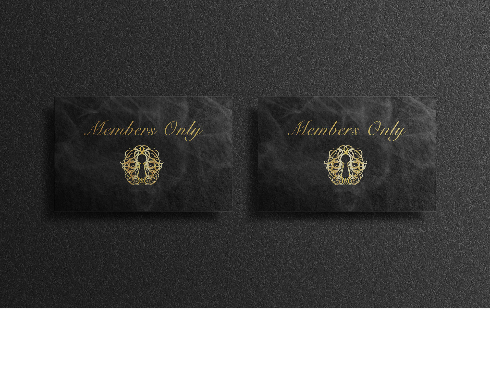
Member card design

Hat design
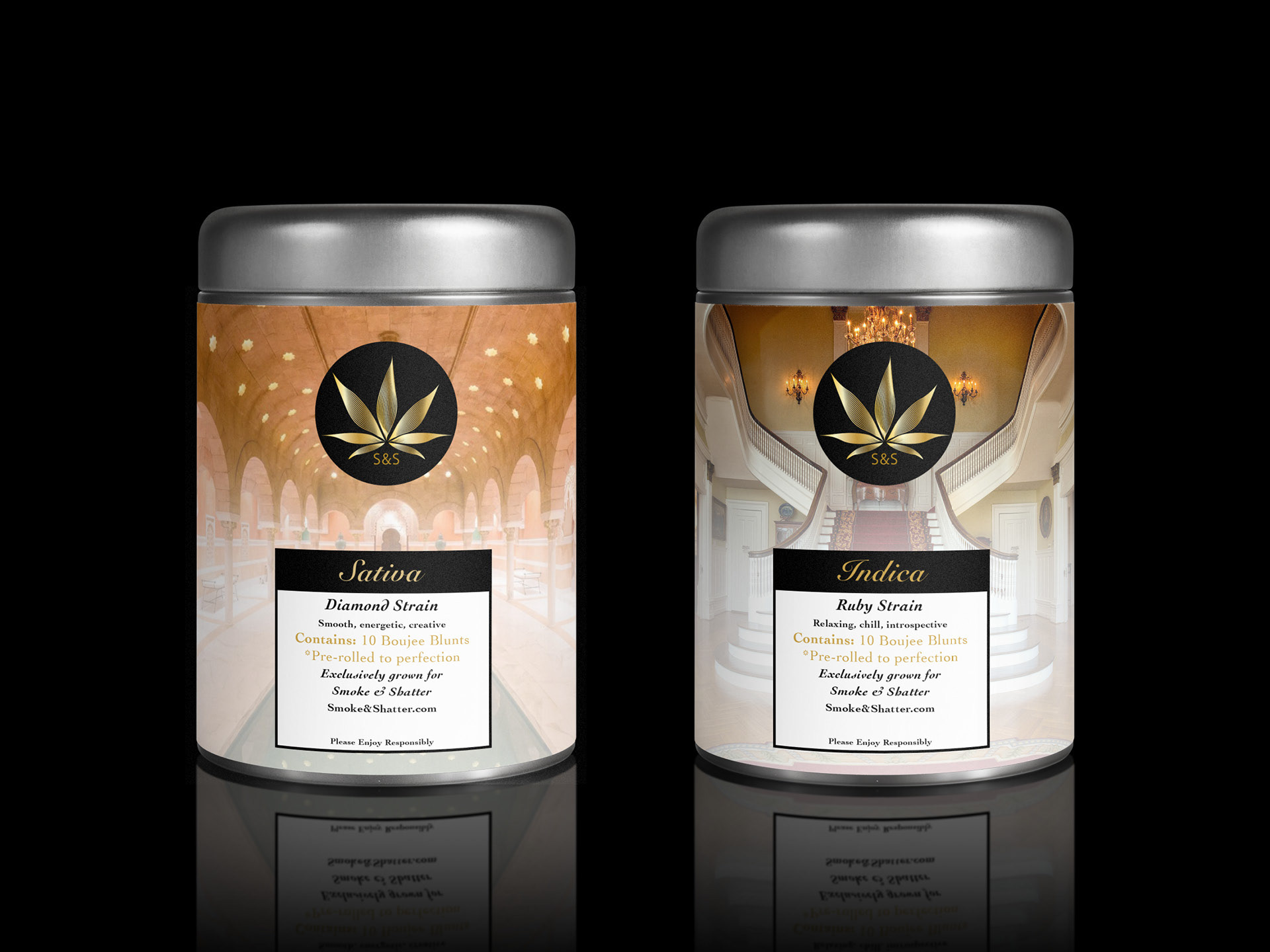
Packaging design

Label design

Poster design
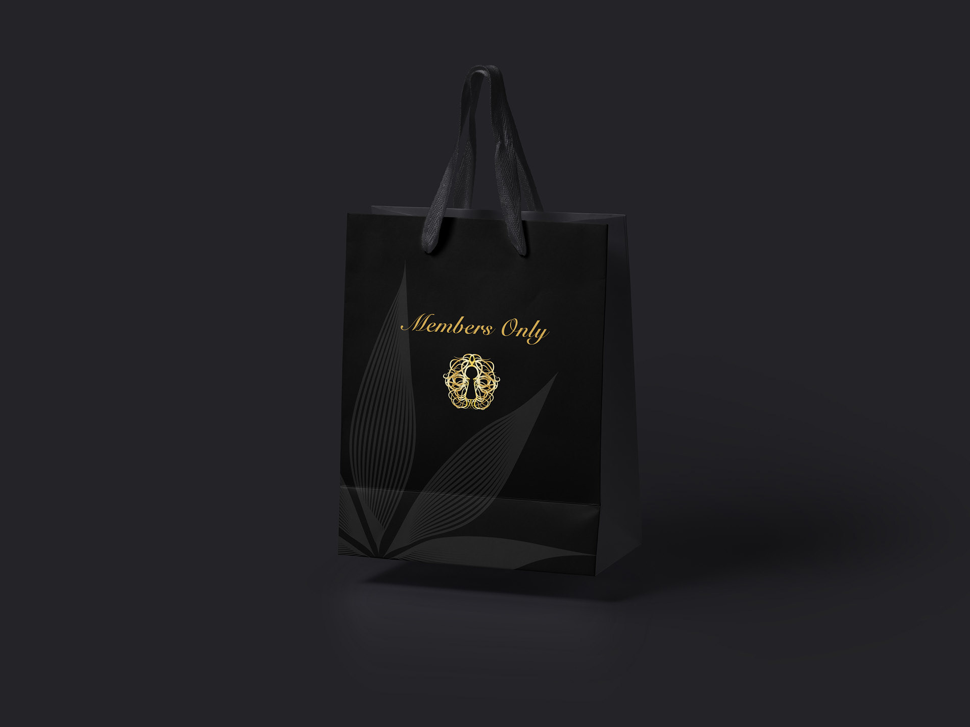
Bag design
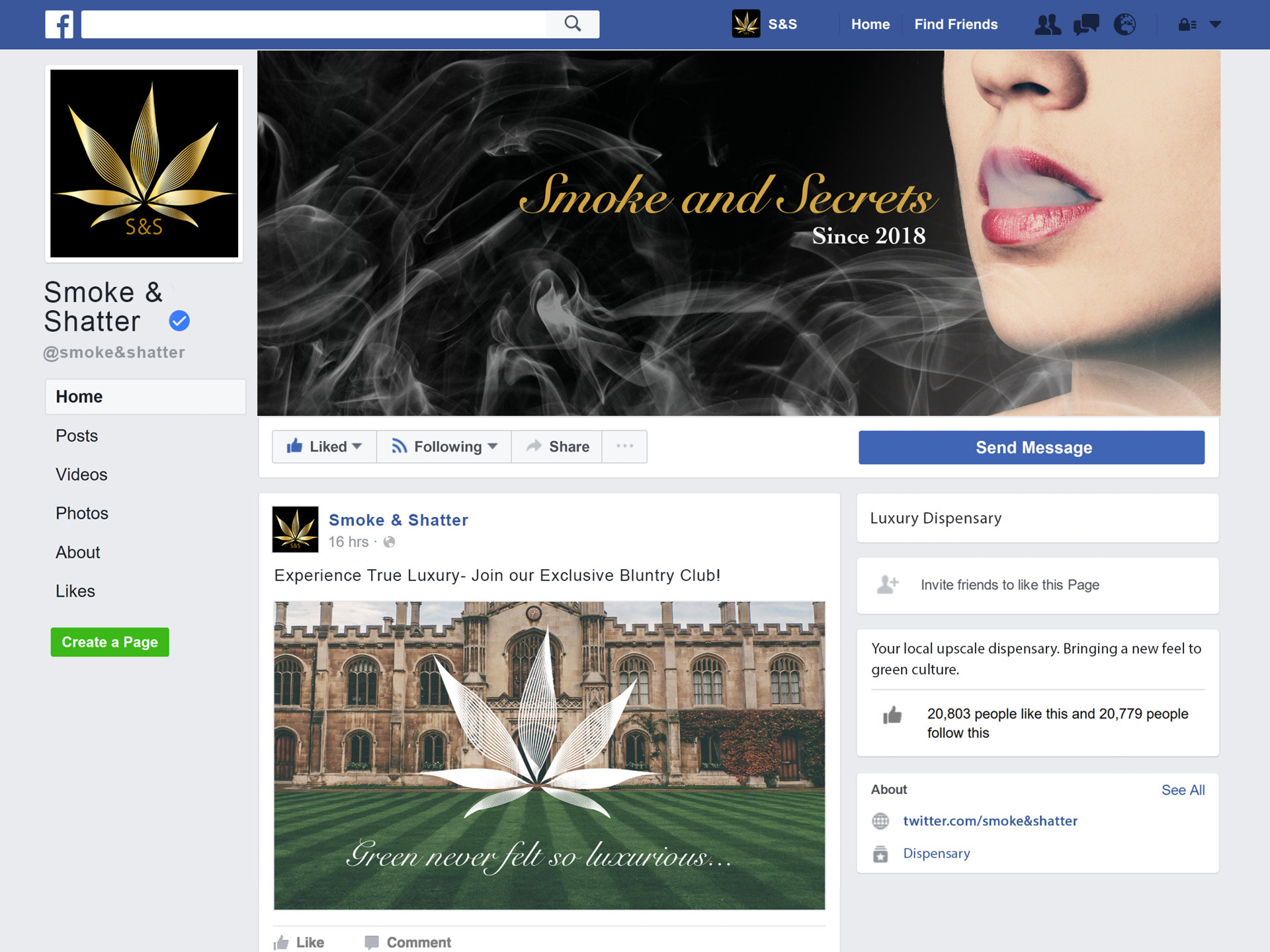
Facebook header and Facebook post design

The branding for Smoke & Shatter is luxurious and mysterious. The venue is a new dispensary in West Vancouver. The colours and logo are meant to subtly represent weed, but not have some of the blatant branding that other dispensaries have. The dark green and gold are luxurious, and make the brand look expensive. The imagery includes mansions and other luxurious images to create an elevated brand.
Member card design
Hat design
Packaging design
Label design
Poster design
Bag design
Facebook header and Facebook post design